Google Data Studio
Some time ago, I discovered a free tool made available by Google. The tool is available to anyone with a google account and is called Google Data Studio. Its purpose is to create visuals of complex data sets. There are already several data visualization tools available for use, the most popular likely being Tableau. Google’s tool provides a similar service, at no charge. Until recently, the tool was available as a “beta” offering. Though it no longer carries that qualification, it does have some work to do before it catches up with its most popular competitors.
Integrations
Data studio utilizes data connections to pull your information into the program. This can be accomplished most easily by connecting it to a google sheets file, however there are now over 260 different data connectors offered by google and third parties, in order to import your data. Data is typically imported in a static format, however some of the third-party integrations allow for regular intervals of data freshness and updating. The Data studio connections also allow for regular intervals of data updates on daily, weekly, or monthly intervals. Use of third-party integrations provides for additional options, for a fee. Utilizing their services, data can be updated hourly.
Data Visualization
The process of picking a visualization is much like you find with similar services. There are an abundant number of different charts and graphs to choose from. Each of these is inserted into a “page” where it can be sized to preference. Multiple visuals can be added to page in order to create a dashboard appearance, or a single visual can take up an entire page. Multiple pages can also be created in a single report style format. Data visuals can be categorized by geo location as well allowing for displays utilizing map features. If your dealing with data from multiple states, this type of visual can be a powerful way to demonstrate state to state variations. Geo location can be as small as zip code level and as large as country level.
Chart building utilizes a familiar “dimension” and “metric” nomenclature and charts can be filtered by any of the inputs. Common filters include date ranges and locations. Complex charts can be built by combining multiple inputs, like multiple spreadsheets. Assigning common variables (like a state column, or a data column) allows for Data Studio to correlate data across multiple sources. This is not a unique feature but certainly helpful when you have multiple data sets. It eliminates the need to assimilate all the data into one source before building the visualization.
Display
One of the advantages to data visualization software is the ability to build interactive charts. In this arena, Google’s Data Studio does not disappoint. Charts are displayed in vibrant colors with a number of options to adjust background, individual column size, and color. Lines for trends can be added and hovering over individual columns can display an array of information. In addition, multiple charts placed on the same page can be set to filter by user selection. This means selecting a state on a map, for example, can filter other charts on the page to focus on the state’s data.
In addition, completed charts can be published with private links, embedded using iframe, or exported to pdf. This allows for others to interact with your charts on your website. Embedding charts comes with a small Google Data Studio logo in the footer bar of the visual and a link to the Google Data Studio file where the visual can be viewed in a window by itself. There are also settings to allow users to see the underlying data or keep it private.
All these features add up to a powerful tool that is rather user friendly compared to its competitors. Where the tool can use some improvement is the area of mobile responsiveness. Iframe has limitations when it comes to embedding charts. These charts are easy to visualize on a desktop but much of our information is consumed on mobile platforms. In order to create an improved mobile experience, it is possible to build a separate visual specifically for mobile users and adjust the page size to match a typical mobile screen. Thought this a functional workaround, competitors have overcome the mobile responsiveness issue eliminating this step for users.
Summary
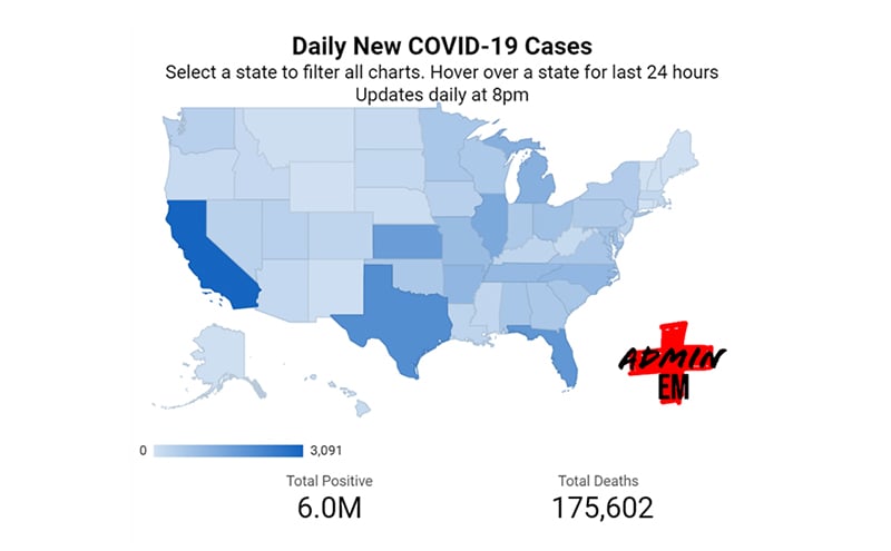
As an example of what can be built utilizing the service, for free, I built two COVID-19 trackers.

Until mid-August both these visual were pulling data from the COVID-19 Tracking Project to a google spreadsheet and then being imported to Google Data Studio. From there, two identical displays were created: one for the desktop experience, and one for the mobile user. It is certainly a vary capable product and its offering at no cost makes it very attractive for personal projects and even short-term enterprise projects. Larger data sets that encompass longer periods of time would benefit from a paid data storage solution like Google’s Big Query, but can easily be visualized in Data Studio as well. Regardless, I have found it to be a very helpful tool and I look forward to Google’s improvement of the service as it matures.
Should you have questions about how to set up your own visualizations using the service, feel free to reach out to me. Always good to talk to a fellow data lover.
Sam Ashoo, MD, FACEP
Founder/CEO
Admin EM


